|
|
Post by CelestialHusky on Jan 8, 2007 3:53:26 GMT -5
Hey, does anyone happen to have the StarTropics font? or individual letters in .gif or something format? I could really use them for a theme project I'm working on for my PSP.  -Miles |
|
gellin
Administrator  startropics.com
Posts: 560
|
Post by gellin on Jan 10, 2007 2:07:46 GMT -5
There's a good font called Placard Condensed that very closely resembles the ST font. It cost money though and I haven't found it on the internet anywhere for free. With enough google searching though, I know there is a site that lets you type in whatever you want and preview it in that font. I don't remember what the site was called though. You could also use Impact for the font but the other one is better. Make sure you send me your PSP theme when your done and I can put it up on my site if you want.
|
|
|
|
Post by Mitchel Kennedy on Jan 10, 2007 18:42:16 GMT -5
|
|
CKY2K
C-Serpant Slayer
 Island Courage
Posts: 233
|
Post by CKY2K on Jan 15, 2007 13:59:26 GMT -5
Well if you want to use the cartrage title font then use times new roman, and use smallcaps.
|
|
|
|
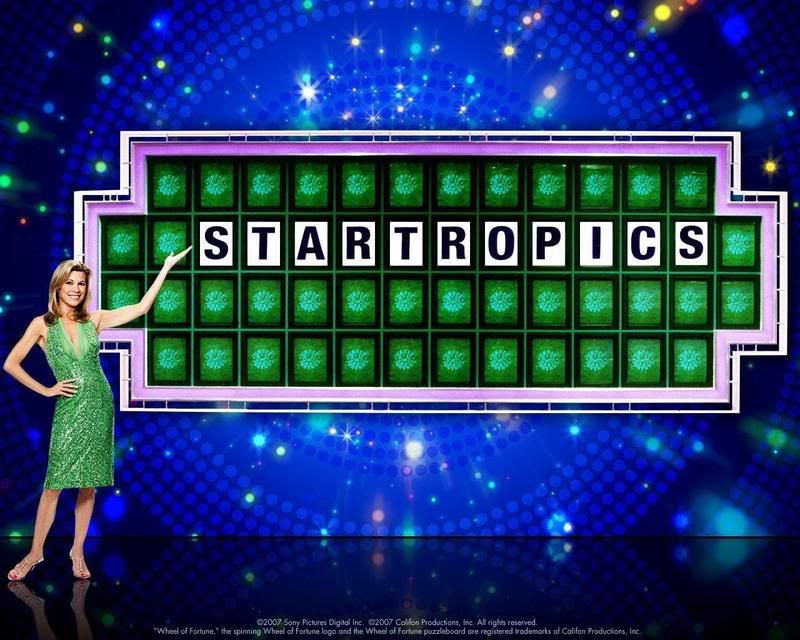
Post by CelestialHusky on Jan 17, 2007 2:39:08 GMT -5
I went ahead and took the liberty to do this myself from scratch on most of the letters, using the STARTROPICS from the game itself as a outline for the rest, you can let me know what you think. Feel free to use them if you want. I will have lowercase letters done at some point. -Miles  |
|
|
|
Post by Michael Jones on Jan 17, 2007 17:33:35 GMT -5
IMO I think the M look a bit off, maybe all of it should touch the bottom. Other than that I think they are amazing and that you did a great job.
|
|
Scotty D.
Administrator
Totally Awesome Dude
Roll Initiative!
Posts: 7,312,445
|
Post by Scotty D. on Jan 17, 2007 17:39:50 GMT -5
I am inclined to agree w/ MJ...that and, IMHO, I think the E and F should be a bit thinner...
|
|
Icarus
C-Serpant Slayer
Miyamoto will conquer the evils of those who will not Wii!!!!!
Posts: 203
|
Post by Icarus on Jan 17, 2007 20:46:16 GMT -5
N/M/W/Q all look a wee-tad funny.
|
|
Coralcola
Global Moderator
Forget the Hollywood mess. If I was host, I'd have Wheel tape on C-Island. :)
Posts: 1,981
|
Post by Coralcola on Jan 17, 2007 21:42:46 GMT -5
I would symmetrisize (is that even a word!?  ) the M and W, and leave everything else alone. Cool stuff!!!  |
|
|
|
Post by CelestialHusky on Jan 18, 2007 4:45:49 GMT -5
Thanks for the positive replies guys, I agree with you some of them looks "weird" if anyone wants to try their hand at it, go ahead, I would like to have a complete font finished at some point. -Miles EDIT: Updated, added a few things to it.  |
|
Scotty D.
Administrator
Totally Awesome Dude
Roll Initiative!
Posts: 7,312,445
|
Post by Scotty D. on Jan 18, 2007 9:07:25 GMT -5
The M and W look much better, Miles...nice job!
|
|
|
|
Post by nightscrabbler on Jan 18, 2007 11:48:06 GMT -5
That's so cool I have to find an excuse to use it! |
|
Coralcola
Global Moderator
Forget the Hollywood mess. If I was host, I'd have Wheel tape on C-Island. :)
Posts: 1,981
|
Post by Coralcola on Jan 18, 2007 13:46:32 GMT -5
That did the trick! Great job! How about I start posting all my messages in that font?  |
|
|
|
Post by nightscrabbler on Jan 18, 2007 15:31:43 GMT -5
I think the Q should be changed a little because when you put a U beside it, the gap will look weird. Observe  Also, this topic should be in ST General. |
|
Scotty D.
Administrator
Totally Awesome Dude
Roll Initiative!
Posts: 7,312,445
|
Post by Scotty D. on Jan 18, 2007 17:44:18 GMT -5
*BUMP*
|
|


 ) the M and W, and leave everything else alone. Cool stuff!!!


