Scotty D.
Administrator  Totally Awesome Dude
Roll Initiative!
Totally Awesome Dude
Roll Initiative!
Posts: 7,312,445
|
Post by Scotty D. on May 23, 2006 8:35:02 GMT -5
That's a little better, coralcola lol. It's really good! Are you going to put in any more screenshots of the slide show into it? Or is it just going to be the one random one w/ Mike and C-Serpent?
Gellin...that's freakin' amazing! I love it!
|
|
Coralcola
Global Moderator
Forget the Hollywood mess. If I was host, I'd have Wheel tape on C-Island. :)
Posts: 1,981
|
Post by Coralcola on May 23, 2006 10:22:06 GMT -5
TY S2H! I could always add more to it. I just added the one of the C-Serpent to start because I wanted the island shown to be representative of C-Island. There's no reason why I couldn't add more pictures that represent C-Island to it...  The one you made gellin is most EXCELLENT! I wanted to use the ST title backdrop screen originally, but my photoshop skills are just-about non-existent, so I never could've done something like that. I had to do my ole pixel-by-pixel technique on paint to get the colors to look good and blend well together...  |
|
|
|
Post by Michael Jones on May 23, 2006 11:32:56 GMT -5
Yours is going well Coarlcola. It looks good so far.
That was a really good idea gellin. I really like it.
|
|
startropicsmaster
Argonian Hero
 The best intentions invite the worst trouble...
Posts: 728
|
Post by startropicsmaster on May 23, 2006 16:21:36 GMT -5
I only have one thing to say about Gellin's. And it's only to words.
HOLY S***!
As for Coraccola, nicely done as well.
Here's something I did. It's more of a game cover, but I think for a 12 year old drawing freehand in paint, it's pretty good.
...erm. Ok, how can I put in an image?
|
|
|
|
Post by Michael Jones on May 23, 2006 17:38:40 GMT -5
|
|
gellin
Administrator
startropics.com
Posts: 560
|
Post by gellin on May 23, 2006 18:48:59 GMT -5
Thanks for all of the compliments guys. I'm glad you all like it.
|
|
startropicsmaster
Argonian Hero
The best intentions invite the worst trouble...
Posts: 728
|
Post by startropicsmaster on May 24, 2006 17:26:07 GMT -5
ok, here goes.  Nice, huh? (Ps, if needed, I can put this in the "Any Fanart" secion.) |
|
gellin
Administrator
startropics.com
Posts: 560
|
Post by gellin on May 24, 2006 23:28:49 GMT -5
Wow nice work STM!!! That is most impressive. Anyways, I liked my wallpaper but I actually set it as my background and it was far too distracting and I couldn't find half of my icons so I made a slight variation of it  |
|
Scotty D.
Administrator
Totally Awesome Dude
Roll Initiative!
Posts: 7,312,445
|
Post by Scotty D. on May 25, 2006 7:55:35 GMT -5
Ooo...I like that one!! [EDIT]I updated my other one. It's actually completely different lol. here it is:  [/EDIT] |
|
startropicsmaster
Argonian Hero
The best intentions invite the worst trouble...
Posts: 728
|
Post by startropicsmaster on May 25, 2006 17:25:05 GMT -5
awesome! Oh, here's my other one.  Well, that's all I've done so far. If anyone has suggestions for anymore I could do, please tell me. |
|
Scotty D.
Administrator
Totally Awesome Dude
Roll Initiative!
Posts: 7,312,445
|
Post by Scotty D. on May 25, 2006 20:36:27 GMT -5
Not bad...but I'd suggest moving the second line of text up into the green...as it's hard to read with the white letters agains the yellow background. Also...maybe try toning down the yellow to a darker shade, as it's hard on the eyes.
|
|
|
|
Post by Matt on May 26, 2006 22:42:57 GMT -5
Gellin, I'm going to get really nit picky about the words StarTropics on you background. I'll assume your using Photoshop. First off, although the font your using is quite similar to the ST font, (I'd guess its Impact) theres one thats alot better, called Placard Condensed. Also, in the title, StarTropics is in all caps. Finally the gradient is a little off. You have it gradually fading from a light blue to green. However their should be a sharp distinction between the two.
But I really like the cubes thing with the pictures, that looks awesome.
|
|
|
|
Post by Mitchel Kennedy on Jun 2, 2006 19:14:17 GMT -5
Wow guys, these are all really awesome! Way to go!  |
|
|
|
Post by Matt on Jun 5, 2006 20:43:34 GMT -5
Gellin, I just noticed something else which struck me as not quite right. The blue in your background, you have it fading in to the black, but I was watching the intro and it was a straight line between the two. I couldn't figure out what it was, but after watching it a few times, I realized the blue is the ocean, so it wouldn't really be natural for it to fade into the sky, sea what I'm saying (hehe, its a pun).
|
|
|
|
Post by CelestialHusky on Sept 16, 2006 9:20:41 GMT -5
I know this topic a bit old, but I decide to make some Higher Resolution ST Logo's from SCRATCH.. to go with your guys wallpapers if you decided to make them using this one. 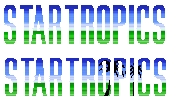 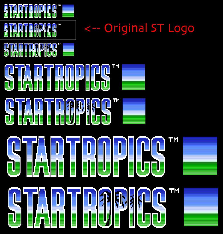 -Miles |
|